Cupola installed in period 1920's property

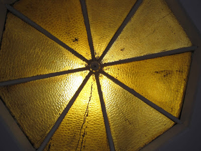
Glasgow-based Verrier Art Glass Designers have recently completed the installation of a Cupola for a client who had purchased a house built in the early 1920’s. The original cupola had become ugly over the years through exposure to nicotine and general dirtiness.
Rather than trying to clean it, the client decided to replace it with something in keeping with the period of construction that would allow light through into the hallway, but also obscure the view of the roof.
The house was built as part of a development of individual bungalos in the wealthy suburb of Giffnock, to the south of Glasgow. It stands on high ground above the city, allowing views over the city to the north and across countryside to the west.
Along with several other houses in the development it had space for two rooms in the roof where a sky light allowed borrowed light to come through the cupola into the central hallway. However, this house had only plain glass inserted into the framework when built. Over the years, it had a build up of varnish, dirt and nicotine to give the deep brown colour that became so objectionable.
Proprietor Stephen Richard takes up the story: "The original query was whether other glass could be put in to allow light through. In discussion, the client and I came up with a design from the end of the Arts Nouveau period - which overlapped with the beginning of the Arts Deco, or Modernist period as it was known then.
"The current owner took over ownership of the house and renovated it, making it wheel chair friendly. At the same time I was working on the design and building so that it would flow around the whole cupola. The traditional design would have been to have eight repeating motifs, however this forms a much more pleasing and complex imagery than the formal terms of the traditional.

"So I came up with a variation. I worked on making a simple but clearly rose shape instead of the elongated buds that were the colourful feature of the first design. I also worked to bring more of the colour lower into the panels.
"At this stage the colour choices were made between the client and me. Templates were checked again and final measurements made. The full size cartoons were drawn up and the construction then began of the eight panels.
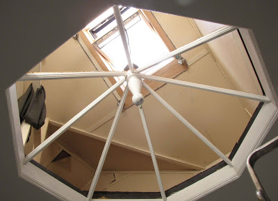
"The kind of transformation that was to be created was revealed when the old glass was removed. The amount and quality of light flooding into the hallway was amazing. This photo shows the difference in the light from the original glazing.
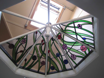
 "The cleaning of the checks and installation of support bars then began. This view shows that there is still a lot of light being allowed through the seedy clear glass and the textured coloured glass, although the features of the underside of the ceiling is diffused.
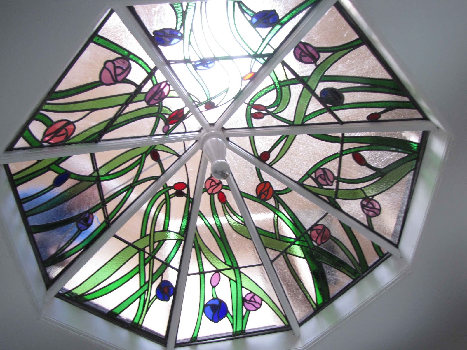
"There continued to be a bit of jiggling and adjustment to get the design to flow as intended. But the installation was completed to the satisfaction of the client (most important) and me.
"We have now installed the cupola! It was seven and a half hour process for the three of us on the project which has been arduous, but one which has left me happy.
 "I made the choice to move away from the traditional use of one design in a repetition toward realising an image for the whole cupola. This makes more sense in modern terms (although not in economic ones). It is less frequently chosen, as there is more design work - making a single design eight times larger than a single panel. There is also much more care and effort required to get the flow of the design to meet over the whole opening. But, I think it has given a much more pleasing result that can provide interest over time as new elements are discovered by the viewers.
"A chandelier will hang from the central pendant post, which will reflect the colours at night especially as the spotlights above transfer the light to the glass pendants of the chandelier."
For further information visit the website at www.verrier-glass.blogspot.co.uk


